You are using an out of date browser. It may not display this or other websites correctly.
You should upgrade or use an alternative browser.
You should upgrade or use an alternative browser.
New site is up. New name. What do you think?
- Thread starter Sarge
- Start date
Honestly I don 't mind the new site. It is something fresh, Gray Lines will be missed. 
Honestly the goal was to bring the site up to 2015 standard with a new clean look and mascot. Which is the silly goat above. There will be much more of the goat coming soon..
Also i am working on integrating a amazing post rating system that will work directly with your role plays. It will be really ground breaking for what you all do in xcom.
Also i am working on integrating a amazing post rating system that will work directly with your role plays. It will be really ground breaking for what you all do in xcom.
Last edited:
Frostlich1228
Well-Known Member
I like it so far, but an option to change the color of the backround would be nice. Other that that it looks good.
Sounds interesting. Can't wait to see. Let's just hope that goat doesn't act the same as his gaming counter part in Goat Sim and blow us all to SPACE!
Adrammalech
Well-Known Member
I like the sound of that.This will be possible soon bug fixing right now.
Other than that, the design and palette change will take some getting used to (and probably break a few posts) but not worth freaking out about. I think from a neutral standpoint it looks good.
I'm not sure whether I love the goat or am creeped out by it. He has that kind of GIR-in-dog-suit charm.
BMPixy
Well-Known Member
While the sudden change came as a bit of a shock to both my retinas and my familiarity, I do find this new theme quite enjoyable. You've succeeded on that clean aesthetic, how the goat comes into play shall be seen.
Also, I'm a bit wary of post ratings, but that's probably just me being cynical and jaded.
Also, I'm a bit wary of post ratings, but that's probably just me being cynical and jaded.
Here is a taste of rating system.While the sudden change came as a bit of a shock to both my retinas and my familiarity, I do find this new theme quite enjoyable. You've succeeded on that clean aesthetic, how the goat comes into play shall be seen.
Also, I'm a bit wary of post ratings, but that's probably just me being cynical and jaded.
MissMetalyssa
New Member
As a new member, I gotta say I love this. It's very simple and the goat is super adorable. Maybe has the outline around the posts a tiny bit darker? I'd like a little more contrast I suppose. Yay Gamigon!
Dahlexpert
Well-Known Member
Well, this caught me off guard but I like the goat.
Welcome thenAs a new member, I gotta say I love this. It's very simple and the goat is super adorable. Maybe has the outline around the posts a tiny bit darker? I'd like a little more contrast I suppose. Yay Gamigon!
Adrammalech
Well-Known Member
A solution for color breaks, for any of the less technically inclined:
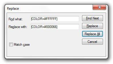
- Go to the post you want to fix and click Edit
- Click the page icon in the top right of the editting box (opposite side of the bold button)
- Copy the entire post
- Open Notepad or any decent word processor you use and paste it into an empty document
- Go back to the editting box and get the BBCode for the color you want to change, and the color you want to change it to, i.e. for pure white text, it's:
Code:
[COLOR=#ffffff] - Go onto Notepad/etc. and press Control-H
- Paste the BBCode into "Find what:"
- Paste the color you want into "Replace what:" and then select "Replace All"
- Copy the entire post and paste it back into the editting box
DarkGemini24601
Well-Known Member
The problem is when its for a mass of posts, like the mission overviews being all messed up. That needs a general fix for white text, and maybe for the hard-to-read gray I've found.
DarkGemini24601
Well-Known Member
I remember that the default was a slightly gray white. Either the manual white was changed, or bolded default stayed white in the transition.
BlueBead
Member
I'm all for the goat, but I designed the goat, so I may be a bit biased.
I have to agree with MissMetalyssa. It's a bit hard to see where one post ends and another begins. Just something as simple as making the box where the poster's icon (and stats like number of messages and trophy points are) a slightly darker color would help ease the eye a lot.
I'm still stupid happy that people like the goat.
As a new member, I gotta say I love this. It's very simple and the goat is super adorable. Maybe has the outline around the posts a tiny bit darker? I'd like a little more contrast I suppose. Yay Gamigon!
I have to agree with MissMetalyssa. It's a bit hard to see where one post ends and another begins. Just something as simple as making the box where the poster's icon (and stats like number of messages and trophy points are) a slightly darker color would help ease the eye a lot.
I'm still stupid happy that people like the goat.
MissMetalyssa
New Member
I'm all for the goat, but I designed the goat, so I may be a bit biased.
I have to agree with MissMetalyssa. It's a bit hard to see where one post ends and another begins. Just something as simple as making the box where the poster's icon (and stats like number of messages and trophy points are) a slightly darker color would help ease the eye a lot.
I'm still stupid happy that people like the goat.
Exactly what BlueBead said. And that goat is perfect, great job!